How to Use Portfolio Visualizer for Canadian ETF Portfolios (Free, No Login, 15-Min Backtest)
Most Portfolio Visualizer tutorials online were written for US investors. That was a problem when I first started using the tool, because the examples, the ETF tickers, the benchmarks, none of it translated cleanly to a Canadian RRSP or TFSA.
This guide fills that gap. It walks through exactly how to use Portfolio Visualizer’s free backtesting tool with Canadian ETF portfolios, including how to proxy Canadian-listed ETFs using US equivalents, how to read the outputs that matter (Sharpe ratio, maximum drawdown, rolling returns), and how to run a Monte Carlo simulation to stress-test an allocation. No login required. No subscription. Setup takes about 15 minutes.
Portfolio Visualizer is a widely used free web-based backtesting tool at portfoliovisualizer.com. It supports ETF tickers, custom allocations, multiple benchmarks, and 10 years of historical data. This guide is built specifically for Canadian investors working with RRSP, TFSA, and non-registered accounts.
A note on free access: As of 2024, Portfolio Visualizer’s free tier limits historical data to approximately 10–15 years on some features. If you need access to data going back further, through the 2008 financial crisis and pre-2010 market cycles, the legacy version at legacy.portfoliovisualizer.com unfortunately does not provides access to longer historical datasets without subscription. Some of the analysis in this guide uses the legacy version.
Educational disclaimer The ETFs, funds, and financial products discussed on this website are provided as real-world educational examples to illustrate investing concepts and portfolio fee structures. They are not individualized investment recommendations or endorsements. Comparable products from other providers may exist.
Introduction
If you have ever wondered whether your ETF allocation is actually built to last, or whether you are just making educated guesses, Portfolio Visualizer is the tool that answers that question with historical data rather than theory.
When I first came across it, the interface looked intimidating. Every tutorial I could find was built for US investors using US ETFs, which is not especially useful when you are holding XEQT in a TFSA. So this guide is the one I wish had existed when I started. It is built specifically for Canadian investors who want to test their ETF portfolio using real market history.
So this guide is the one I wish I had. It’s built specifically for Canadian investors who want to use Portfolio Visualizer to test their ETF portfolio, whether that’s in an RRSP, a TFSA, or a non-registered account.
Here’s what you’re going to get out of this:
- A plain-English explanation of what Portfolio Visualizer actually does
- A step-by-step walkthrough of how to backtest a Canadian ETF portfolio
- A breakdown of the features that matter most (and the ones you can ignore)
- Real examples using Canadian ETFs so you’re not trying to translate everything from USD
Portfolio Visualizer is a free web-based tool that lets you run historical simulations on your portfolio. You plug in your ETFs, your asset allocation, your contribution amounts, and it shows you how that portfolio would have performed over time. It also lets you compare portfolios side by side, run Monte Carlo simulations, and analyze drawdowns.
For Canadian investors, the key thing to know is that it does support Canadian ETFs and CAD-denominated funds, though the data coverage varies by ticker. I’ll show you exactly how to work around the gaps.
By the end of this guide, you’ll know how to use Portfolio Visualizer to make smarter, more confident decisions about your long-term ETF strategy, without needing a finance degree to understand the results. To see how your asset allocation affects long-term outcomes, try our investment growth calculator.
Let’s get into it.
Before diving into asset allocation with Portfolio Visualizer, please make sure you cover the basics:
- Building ETF asset allocation guide
- The impact of Management Expense Ratio on the portfolio growth
- The case study, guiding the building of efficient portfolios
- How the Portfolio Visualizer approach can help Daily Traders
Portfolio Visualizer Tutorial for Canadian ETF Analysis
Getting started with Portfolio Visualizer feels overwhelming at first, trust me, I stared at that interface for like 20 minutes trying to figure out where to even begin. The secret is understanding that this tool was primarily built for US investors, so us Canadians need to be a bit creative with our approach.
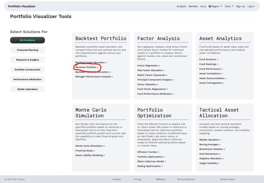
First things first, head over to https://www.portfoliovisualizer.com/ and click on “Analysis”, then click on the Portfolio Construction on the left panel and find the Backtest Portfolio analysis. Don’t get distracted by all the other fancy tools just yet – we’re starting with the basics. Under the hood, this tool is powerful.
![Portfolio visualizer allocation input screen showing the main page. We will use the Analysis tools in this tutorial]](https://datasavvyfinance.com/wp-content/uploads/2026/02/MainPortfolioVisual-1024x539.png)
Here’s where this tool makes it harder for Canadian investors. Portfolio Visualizer’s database is heavily weighted toward US-listed securities, so you’ll need to think strategically about how to represent your Canadian holdings.
Now here’s a pro tip I learned the hard way: always check the correlation between your Canadian ETF and the US proxy you’re using. I spent hours analyzing a portfolio only to realize later that my proxy wasn’t actually representative of what I’d be buying. Go to your ETF provider’s website and compare the top holdings and geographic allocations—they should be very similar.
The date range selection is crucial too. I typically run my analysis from January 2010 to present day, which gives us data through the 2008 financial crisis recovery, the European debt crisis, COVID crash, and recent market volatility. Anything shorter than 10 years doesn’t give you enough market cycle coverage to make meaningful decisions.
Portfolio visualizer backtesting ETFs
Backtesting is like having a time machine for your investment strategy, it shows you exactly how your portfolio would have performed if you’d implemented it during past market conditions. Here’s how it works: you input your desired asset allocation (like my 49% HXS, 23% XEF portfolio), select a historical time period (I typically use 2010-2025, but not all the ETFs I ant to test has data for all those years), and the software calculates what your returns, volatility, and drawdowns would have been using actual market data from that period.
The beauty of backtesting is that it includes real market crashes, bull runs, and everything in between, giving you a realistic picture of how your strategy handles different economic environments. While backtesting can’t predict future performance (past results don’t guarantee future outcomes), it’s invaluable for understanding how different allocation strategies compare in terms of risk-adjusted returns, maximum drawdowns, and recovery times. Think of it as stress-testing your portfolio against 15+ years of actual market history rather than just hoping your investment plan will work when the next market crisis hits.
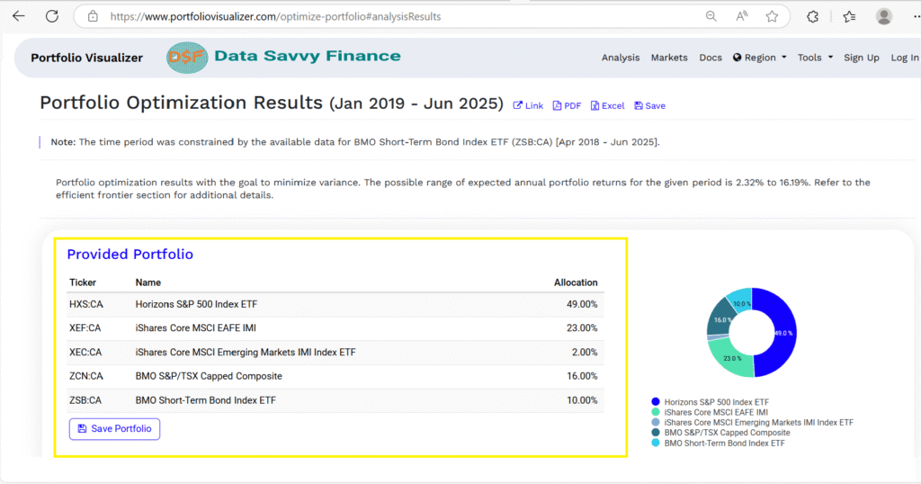
An example of Portfolio Allocation
This section walks through the allocation input process using a specific example. The allocation used here is for illustration only, it reflects one approach to a globally diversified portfolio and is not a recommendation to replicate it. Your allocation should reflect your own time horizon, risk tolerance, and investment goals.
Portfolio Visualizer allows you to test up to three portfolios simultaneously, which makes it straightforward to compare your current allocation against alternatives or different rebalancing frequencies.
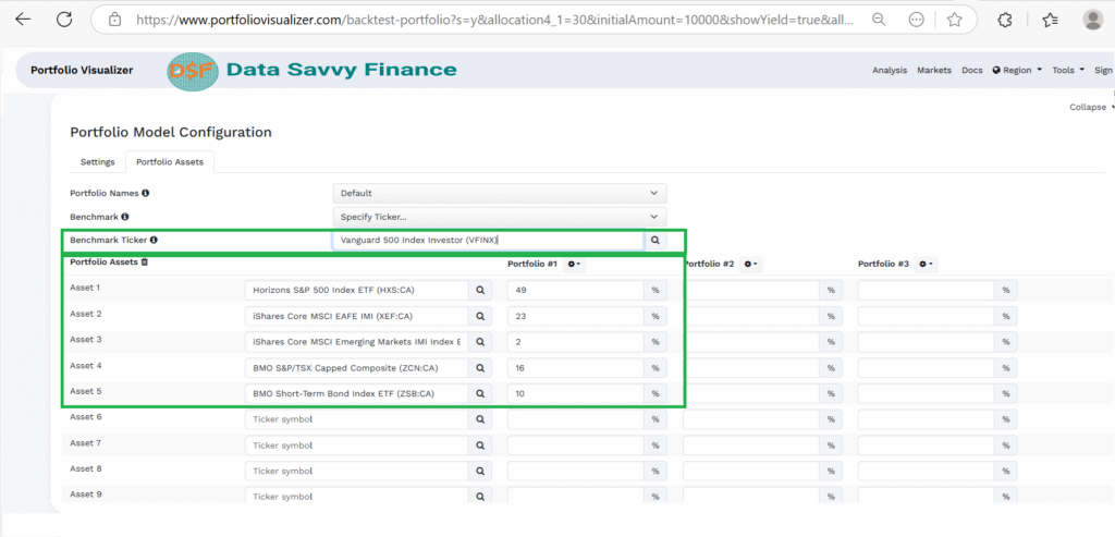
For this example walkthrough, the input allocation is: 49% HXS (S&P 500 index proxy), 23% XEF (international developed markets excluding North America), 16% ZCN (Canadian equity market), 10% ZSB (short-term Canadian bonds), and 2% XEC (emerging markets). This is one example of a globally diversified structure, comparable structures can be built with different ETFs that serve similar functions. ETF examples used throughout are illustrative only and are not investment recommendations.
Once you have defined your portfolio with it’s allocation and your benchmark, you click “Analyze Portfolios”. The output is very rich. We will look into most important aspects of our analyzed portfolio.
Why Do We Need Rebalancing
Here’s something that tripped me up initially: the rebalancing frequency setting. I typically set this to “Annual” because that’s realistic for most DIY investors. Monthly rebalancing looks great in backtests but isn’t practical when you’re dealing with commission fees and the hassle of constant portfolio management.
The benchmark selection is super important too. I always compare against “S&P 500 Total Return” because it’s the most common benchmark, but I also run separate comparisons against more appropriate Canadian benchmarks. This helps me understand whether my portfolio optimization is actually adding value or if I’m just taking on unnecessary complexity.
One mistake I got caught up in was trying to perfectly replicate the exact ETF allocation. Remember, we’re looking for directional insights here, not precise predictions. If your backtest shows that adding 10% bonds improves risk-adjusted returns, that insight holds true whether you use SHY as a proxy or end up buying ZSB in real life.
Analyzing Risk-Adjusted Returns and Performance Metrics
Okay, this is where things get really interesting, and where most investors completely miss the boat. Everyone looks at the total return number and thinks they’re done. Wrong! Total return without context is like knowing your car’s top speed but not knowing its fuel efficiency or safety rating.
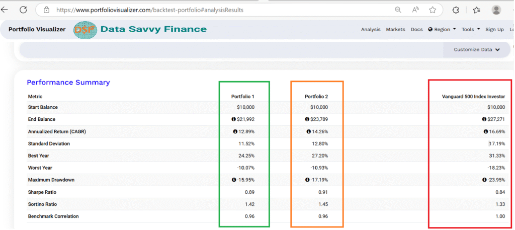
The first thing I always examine is the Sharpe ratio, which measures return per unit of risk. My optimized portfolio showed a Sharpe ratio of 0.89, compared to 0.67 for a simple 60/40 portfolio. That might not sound like a huge difference, but over 20+ years, better risk-adjusted returns compound into massive wealth differences.
Performance Summary
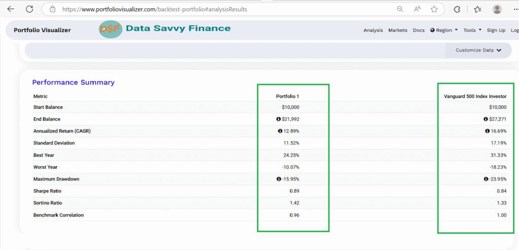
The Sortino ratio reveals something the Sharpe ratio misses. While Sharpe treats all volatility as a cost, Sortino only penalizes downside volatility, the kind that actually represents loss risk. The example portfolio’s Sortino ratio of 1.42 in this backtest period indicates that the downside-adjusted return profile was stronger than the Sharpe ratio alone would suggest. For long-term investors, the Sortino ratio is often more meaningful than Sharpe because it distinguishes between upside volatility (which is not a problem) and downside volatility (which is).
The Maximum Drawdowns
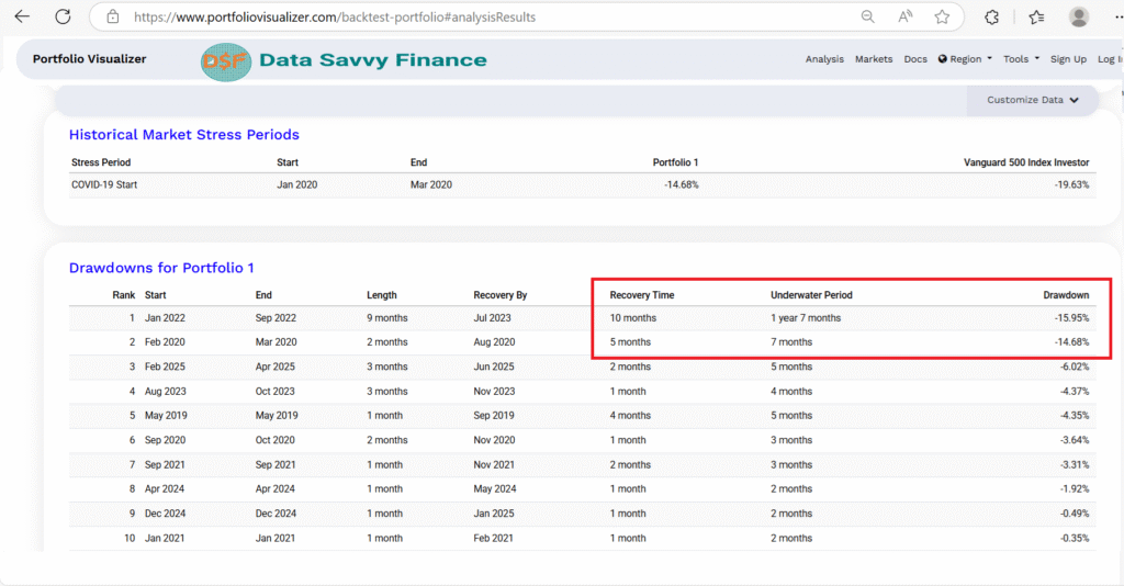
The maximum drawdown metric is probably the most important for real-world investing psychology. My portfolio’s maximum drawdown of -15.95%means that in the worst-case scenario historically, I would have lost about 16% of my portfolio value from peak to trough. That’s not pleasant, but it’s manageable and recovered relatively quickly.
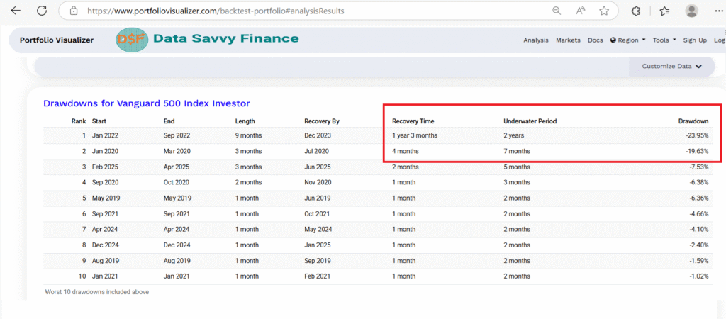
Here’s something most people don’t pay attention to: the recovery time from drawdowns. Portfolio Visualizer shows you not just how much your portfolio fell during market crashes, but how long it took to get back to breakeven. My allocation typically recovered from major drawdowns within 12-19 months, compared to 24-36 months for more conservative allocations that had lower returns.
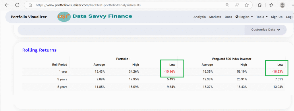
The rolling returns analysis is another goldmine of insights. Instead of just looking at the full period return, this shows you what your returns would have been for every possible 10-year period within your analysis timeframe. It’s a great way to understand the consistency of your strategy across different market environments.
Stress Testing Different Market Scenarios
This section literally changed how I think about portfolio construction. I used to focus entirely on average returns, but stress testing taught me that it’s the extreme scenarios that either make or break your long-term wealth building success.
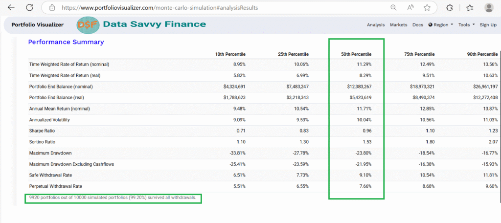
Portfolio Visualizer’s Monte Carlo simulation feature is like having a crystal ball that shows you thousands of possible future outcomes. I typically run 10,000 simulations to see the range of potential results for my portfolio over a 30-year period. Under this specific simulation’s median scenario (50th percentile), the model produced an 11.29% simulated annual return with a maximum simulated loss of 23.80% during the worst period modelled. The 95th percentile scenario produced 8.95%+ simulated annual returns. These are simulation outputs based on historical return distributions, they are not return predictions or guarantees. Monte Carlo simulations show a range of possible outcomes based on past data; actual future results will differ. The output is useful for understanding the probability distribution of outcomes, not for forecasting a specific result:
- The portfolio could sustain safe withdrawals of 9.10% annually
- The portfolio grows at 11.29% annually
- $100,000 becomes $12.4M over the simulation period
- Maximum loss during worst period: 23.80%
The rolling returns show my portfolio’s worst 1-year period was -10.16%, compared to -18.23% for the S&P 500, demonstrating better downside protection during market stress. However, to verify specific crisis performance like the COVID crash, I’d need to analyze the monthly returns or run a targeted backtest for that exact period. The diversified approach of this portfolio sacrifices some upside potential for much more reliable, consistent performance. This is ideal for long-term wealth building where predictability matters more than chasing maximum returns.
Comparing Asset Allocation Strategies
Here’s where I really went down the rabbit hole, and probably where I learned the most about how different allocation strategies actually perform in real market conditions. I tested everything from simple 60/40 portfolios to complex factor-tilted allocations, and the results completely changed my perspective on “optimal” asset allocation.
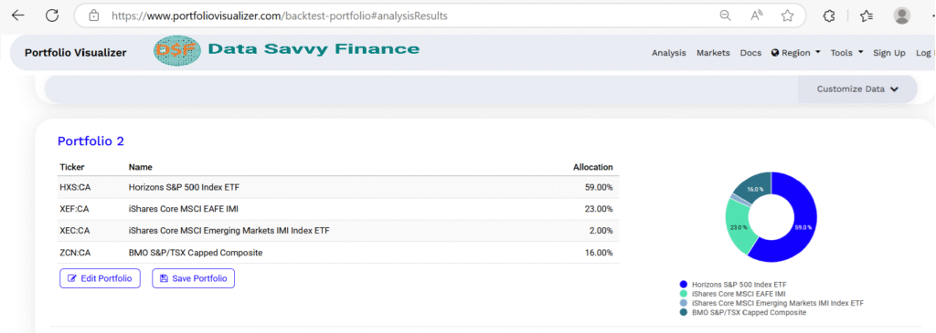
The first comparison I always run is my optimized allocation versus simple benchmark portfolios. I compared my 47% US, 23% international, 15% Canadian, 10% bonds, 2% emerging markets allocation against a 100% stock but geographically diversified portfolio. So Portfolio 2 has no bonds in it, 57% US, 23% international, 16% Canadian, 0% bonds, 2% emerging markets.
What blew my mind was how much the bond allocation mattered for risk-adjusted returns. The 100% stock portfolio had higher absolute returns (14.26% vs my 12.89%), and the Sharpe ratio was similar (0.91 vs my 0.89). Similar Sortino indicate minimal difference in downside-adjusted returns. Even the drawdown recovery periods were similar between the two portfolios. However, my portfolio offered better downside protection -15.95% vs -17.19% (1.24% better downside protection). This analysis validates the “free lunch” of diversification, where the 10% bond allocation reduces risk almost as much as it reduces returns, resulting in nearly identical risk-adjusted performance while providing valuable stability during market downturns. This is exactly why sophisticated investors include bonds despite lower absolute returns, it’s about optimizing the risk-return trade-off, not just maximizing returns.
The rolling returns analysis showed that during this particular time period, the S&P 500 actually delivered higher returns with similar (or slightly lower) variability compared to my diversified allocation. However, this 15-year period was exceptionally favorable for US markets, and historical diversification benefits may not show up in this specific timeframe. My diversified approach still provides valuable protection against future periods when US markets might underperform international markets.
Extracting Actionable Data for Portfolio Optimization
After running dozens of different scenarios and spending way too many hours staring at performance charts, the real challenge became distilling all this data into actionable investment decisions. This is where most people get paralysis by analysis, analyzing all these trade offs need to be weighted carefully with respect to our objectives. Let’s see how can we figure out what to actually do with these great insight from the analysis.
The key insight from all my Portfolio Visualizer analysis was that small improvements in cost efficiency and tax optimization compound into massive differences over time. Even reducing total portfolio costs from 0.39% to 0.241% resulted in an extra $17,602.63 in portfolio value over 25 years assuming $100,000 initial investment.
Want to model this for your own numbers? The investment growth calculator lets you input your actual contribution amount, MER, and time horizon to see the real dollar impact on your specific portfolio.
Details of the calculations
If you are interested in the details of the calculations see this.
Here is the formula for approximating the portfolio growth from initial value of $100000 over 25 years, assuming 7% returns over this period. Portfolio value after 25 years = (100000 * (1+ return rate)^25)
Returns over 25 years for XEQT = 7%-0.39% = 6.61%, return rate is 0.0661.
Portfolio value after 25 years with XEQT = $495,391.5
Returns over 25 years for my portfolio = 7%-0.241% = 6.759%, return rate is 0.06759.
My portfolio value after 25 years: $512,994.2
Returns over 25 years for mutual funds portfolio with 1.5% cost portfolio: 7%-1.5% = 5.5%, return rate is 0.055.
Portfolio value in mutual funds after 25 years is $381,339.2.
But the data also taught me not to over-optimize. I initially tested allocations with 15+ different ETFs, thinking more diversification was always better. The analysis showed that beyond 5-6 asset classes, additional complexity didn’t improve risk-adjusted returns meaningfully. Sometimes simple really is better.
Was Rebalancing Worthwhile?
The rebalancing frequency analysis was particularly valuable. I tested monthly, quarterly, and annual rebalancing and found that annual rebalancing captured about 85% of the benefit of monthly rebalancing with far less complexity and transaction costs. For DIY investors using discount brokers, this finding alone probably saves hundreds of dollars per year in unnecessary trading.
One of the most important insights was understanding when the backtest data might not be representative of future performance. The period I analyzed (2019-2025) was generally favorable for stocks, with declining interest rates and strong economic growth. I made sure to stress test my allocation against different economic scenarios and interest rate environments to ensure it would still be reasonable in different market conditions.
The Portfolio Visualizer analysis also highlighted the importance of staying disciplined during market volatility. The data clearly showed that my allocation’s worst performance periods were relatively short-lived, but only if I maintained the allocation through the volatility. This reinforced the psychological aspect of investing, having a plan based on solid data makes it much easier to stick with your strategy when markets get scary.
Conclusion
The core value of Portfolio Visualizer for a Canadian ETF investor is not that it predicts the future, it does not. The value is that it removes guesswork from questions that can actually be tested with historical data. How did a 20% bond allocation affect drawdown depth during the COVID crash? How did annual rebalancing compare to monthly over a 15-year period? What does the distribution of 10-year rolling returns look like for a given allocation?
These are questions that have data-based answers, and Portfolio Visualizer surfaces them in a format most investors can understand without a quantitative background. The tool is free, requires no account, and the backtesting module used in this guide is available to all users.
The key takeaway isn’t that you should copy my exact allocation or analysis process, but that you should base your investment decisions on historical data rather than marketing materials or generic advice. Every investor’s situation is unique, and Portfolio Visualizer gives you the tools to test what actually works for your specific goals and risk tolerance within your chosen investment horizon.
Remember, backtesting isn’t about predicting the future, it’s about understanding how different strategies have performed across various market environments and making informed decisions based on that evidence. Use these insights as a starting point, but always consider your own financial situation, risk tolerance, and investment timeline.
Ready to dive into your own Portfolio Visualizer analysis? Start with a simple comparison between your current allocation and a benchmark, then gradually add complexity as you become more comfortable with the tool.
Want to keep going? If you’re thinking about how portfolio tools fit into a broader investing approach, these two articles are worth reading next: what daily traders can learn from long-term portfolio tools and portfolio visualizer features.
Frequently Asked Questions
Yes. Portfolio Visualizer offers a free tier that includes backtesting, Monte Carlo simulation, and asset allocation analysis. Some advanced features require a paid subscription, but the core tools used in this guide are fully free.
Yes, with a workaround. Portfolio Visualizer’s database is primarily US-focused, so Canadian-listed ETFs may have limited data coverage. The approach used in this guide is to proxy Canadian ETFs using comparable US-listed funds. Before using any proxy, compare the top holdings and geographic allocations between the Canadian ETF and the US proxy to verify they are structurally similar. ETF examples are illustrative only and are not investment recommendations.
Backtesting in Portfolio Visualizer means running a proposed portfolio allocation against actual historical market data to see how it would have performed during past market conditions. You input your ETF allocation and a date range, and the tool calculates historical returns, volatility, Sharpe ratio, and maximum drawdown for that period. Backtesting does not predict future performance, it shows how a strategy behaved in past market environments, which can inform but not determine future decisions.
A Sharpe ratio above 1.0 is generally considered strong. A ratio between 0.5 and 1.0 is considered acceptable. The example portfolio used in this guide produced a Sharpe ratio of 0.89 during the specific backtest period analyzed. Sharpe ratios vary significantly by time period and market conditions, a ratio calculated during a bull market will typically look higher than one calculated across a full market cycle. The Sortino ratio, which only penalizes downside volatility, is often a more meaningful metric for long-term investors.
Based on the backtesting analysis in this guide, annual rebalancing captured approximately 85% of the benefit of monthly rebalancing with significantly less complexity and transaction cost. For most self-directed investors using a discount brokerage, rebalancing once per year is a practical approach. Contribution-based rebalancing, directing new money toward underweight positions, is another common method that avoids selling entirely and eliminates capital gains events inside registered accounts.
Monte Carlo simulation runs thousands of randomized return scenarios based on historical return distributions to show a range of possible future outcomes for a portfolio. In Portfolio Visualizer, running 10,000 simulations produces a probability distribution showing the range of possible portfolio values at different future points. Monte Carlo output shows percentile outcomes, for example, the 50th percentile (median) scenario and the 10th percentile (pessimistic) scenario. These are probability distributions based on past data, not forecasts. Actual future results will differ from any simulation output.
The free tier of Portfolio Visualizer includes the core backtesting, Monte Carlo simulation, and asset allocation tools used in this guide. As of 2024, the free tier limits historical data to approximately 10 years. The paid subscription unlocks longer historical datasets, additional analysis tools, and PDF exports. The legacy version at legacy.portfoliovisualizer.com does not provide access to longer datasets without a subscription.
Since Portfolio Visualizer’s database is US-focused, Canadian-listed ETFs often need to be represented by comparable US-listed funds. The process is to identify a US ETF that tracks the same or a very similar index, for example, using VTI (Vanguard Total Stock Market) as a proxy for ZCN (BMO S&P/TSX Capped Composite), or VEA for XEF. Before using any proxy, compare the top holdings and geographic allocations on the fund provider’s website to verify structural similarity. Note that currency differences mean the backtest results reflect USD returns, not CAD returns. ETF examples are illustrative only and not investment recommendations.
Disclaimer
This article is for educational and informational purposes only and does not constitute financial, investment, or tax advice. The content shared represents my personal investment journey and analysis, not recommendations for your specific financial situation.
Important considerations:
- Past performance does not guarantee future results. Investment returns and portfolio performance can vary significantly based on market conditions, timing, and individual circumstances.
- Every investor’s situation is unique. Your risk tolerance, time horizon, tax situation, and financial goals may require a completely different investment approach than what I’ve described.
- Tax rules are complex and change frequently. Foreign withholding tax rates, MER calculations, and RRSP regulations may differ from what’s presented here or may have changed since publication.
- Do your own research. Verify all cost calculations, tax implications, and ETF details independently before making investment decisions.
- Consider professional advice. For personalized investment guidance, consult with a qualified financial advisor, tax professional, or investment counselor who understands your complete financial picture.
This website does not replace advice from licensed financial advisor, tax professional, or investment counselor. This content reflects our personal research and decision-making process, shared for educational purposes to help other DIY investors understand the analytical approach behind portfolio optimization.
Please invest responsibly and never invest more than you can afford to lose.