Portfolio Visualizer Features: Every Free Tool Explained: Backtesting, Monte Carlo, Drawdowns, Rolling Returns (2026)
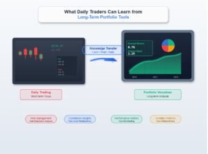
Portfolio Visualizer is a widely used free backtesting and portfolio analysis toolset. This guide covers every major feature, what it does, how to use it, where the free tier hits its limits, and where each tool has analytical constraints worth knowing before you rely on the output. The goal is to be useful for both first-time users and investors who have been using one or two features without exploring the rest.
Educational disclaimer The ETFs, funds, and financial products discussed on this website are provided as real-world educational examples to illustrate investing concepts and portfolio fee structures. They are not individualized investment recommendations or endorsements. Comparable products from other providers may exist.
Introduction
When I first landed on Portfolio Visualizer, the interface was bare-bones, the menus were not obvious, and there was no onboarding. It takes a few minutes to find where things are. Once I understood what the tool could actually do, it covered the analytical questions I was asking about my own portfolio without needing additional paid tools.
Portfolio Visualizer is a free web-based tool that lets you backtest investment portfolios,
run Monte Carlo simulations, stress test against historical crashes, and analyze rebalancing strategies using decades of real market data. No login required for most features.
This guide breaks down every major feature, what it does, how to use it, and where
the free tier hits its limits, using a simple three-fund portfolio as the running example throughout.
The free tier covers 9 years of data, roughly 2017 to 2026, which is enough to capture three meaningfully different market shocks: an inflation-driven rate cycle, a pandemic collapse, and a liquidity correction. Each one behaved differently, which is more instructive than a longer dataset showing repeated versions of the same event type.
What Is Portfolio Visualizer and Who Is It For?
Portfolio Visualizer is built for self-directed investors who want to test their portfolio ideas before committing real money. It pulls historical return data going back to 1972 for many asset classes, which is far more history than most free tools offer.
Think of it as a flight simulator for your portfolio. You can test how a 60/40 portfolio would have
performed through the dot-com crash, the 2008 financial crisis, and the 2020 COVID selloff,
all before you put a single dollar in. The tool won’t tell you what to buy, but it will show you how
your current allocation has behaved historically under real stress.
The free tier covers the most useful features for individual investors.
The paid plan, which runs around $30/month, unlocks factor analysis, additional asset classes,
and longer data history for some funds.
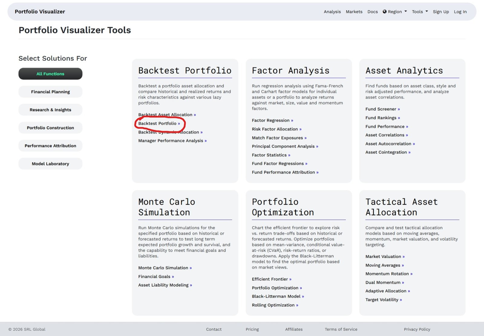
Backtesting: How It Works and What the Data Actually Means
Backtesting is the feature most people come to Portfolio Visualizer for, and it’s genuinely
powerful once you understand what it’s showing you.
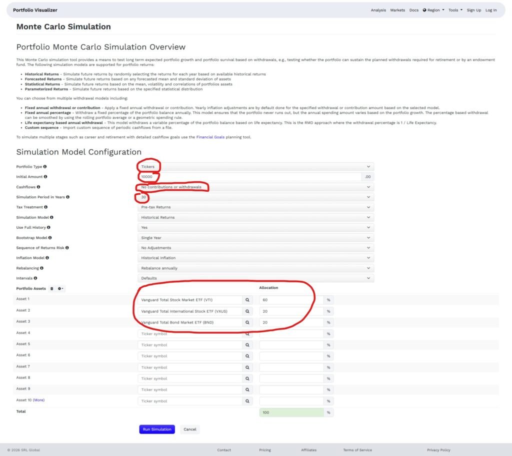
Here’s how it works. You enter a starting date, an initial investment amount, and a list of
tickers with percentage allocations. Portfolio Visualizer then calculates how that portfolio would
have grown using historical monthly return data, adjusted for dividends and splits.
Source: https://www.portfoliovisualizer.com/
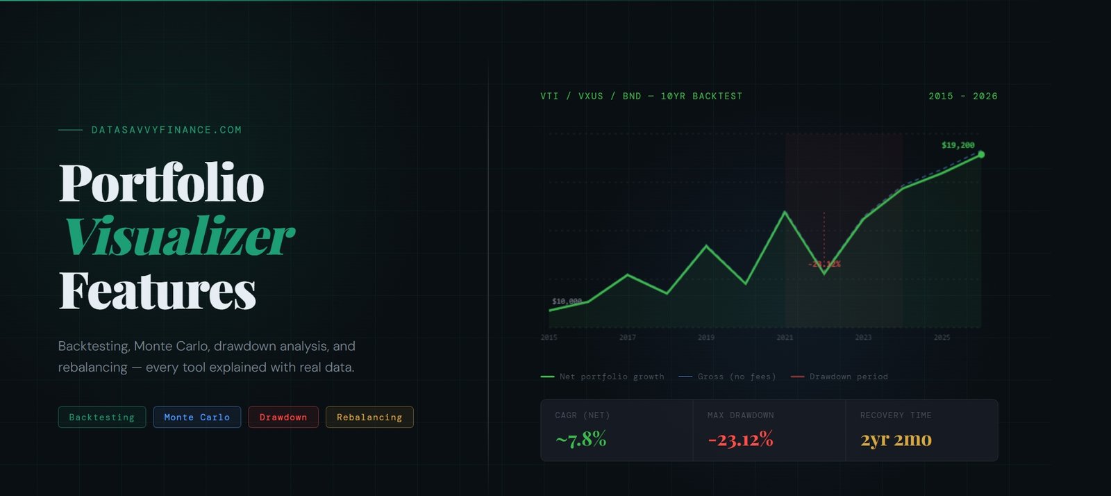
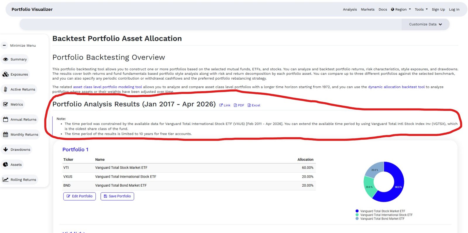
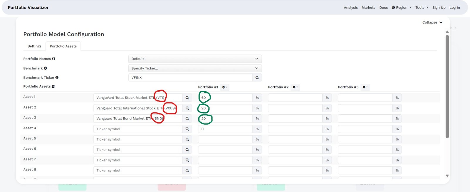
For the examples in this guide, I am using a three-fund portfolio as the running illustration: 60% VTI (Vanguard Total Stock Market, MER 0.03%), 20% VXUS (Vanguard Total International, MER 0.05%), and 20% BND (Vanguard Total Bond Market, MER 0.03%). This is a widely referenced three-fund structure used for educational illustration throughout this guide, it is not a recommendation to use this specific allocation. Total annual fees on this example come to under 0.05%.
Source: https://www.portfoliovisualizer.com/
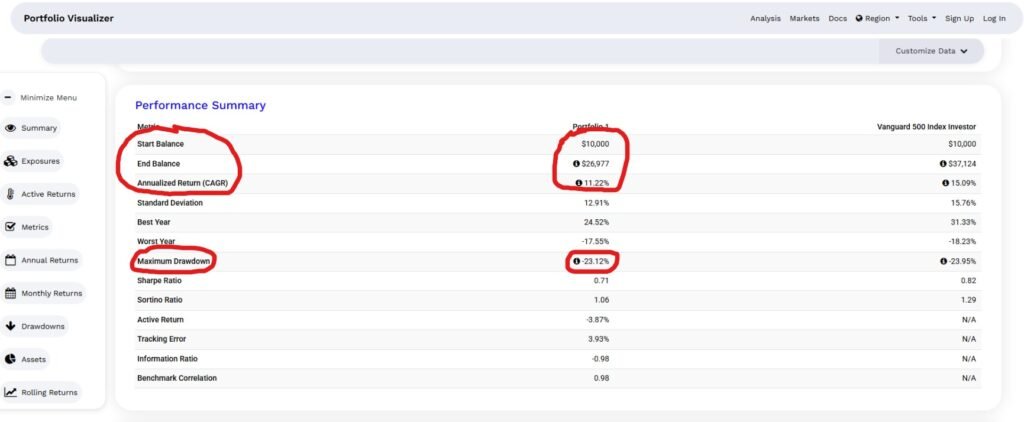
The results show you the portfolio’s ending balance, compound annual growth rate (CAGR),
best and worst years, Sharpe ratio, and maximum drawdown. Maximum drawdown is the one I always look at first. It tells you the worst peak-to-trough loss that portfolio experienced in the test period, which gives you a realistic sense of what “riding it out” actually feels like.
One thing to keep in mind: backtesting shows you what happened, not what will happen.
A portfolio that performed well from 2010 to 2024 had a historically unusual bull run behind it.
The data is useful context, not a guarantee.
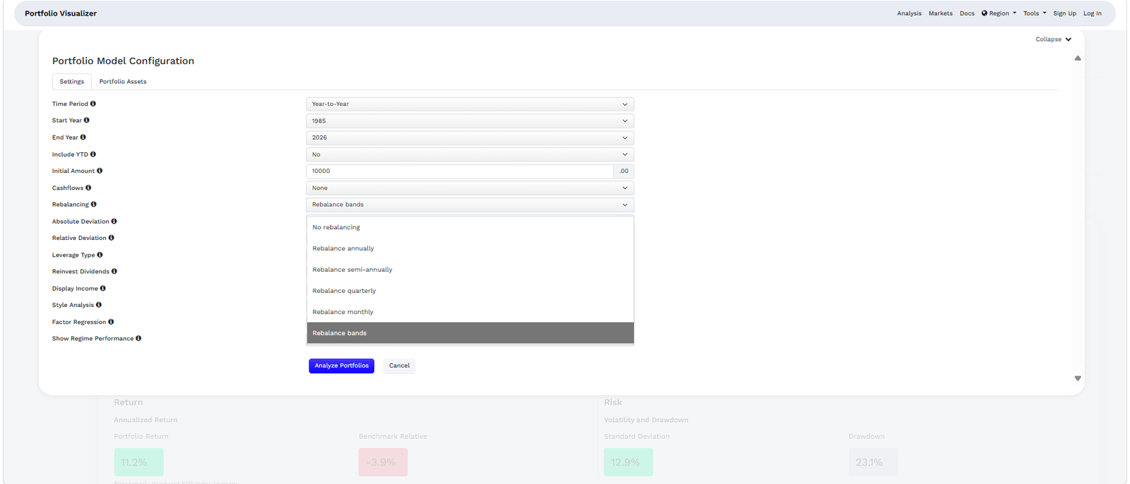
Rebalancing Options: Threshold, Calendar, and Buy-and-Hold
Most investors know they should rebalance their portfolio but aren’t sure how often or by how much. Portfolio Visualizer lets you test three different rebalancing strategies side by side.
No rebalancing (buy-and-hold) lets your original allocation drift over time.
If stocks outperform, your equity allocation grows beyond your target.
This strategy often shows higher returns in long bull markets because you’re letting winners run.
Calendar rebalancing resets your portfolio to its target allocation at a fixed interval,
monthly, quarterly, or annually. Annual rebalancing is what most long-term passive investors use, and the research generally supports it as a reasonable default.
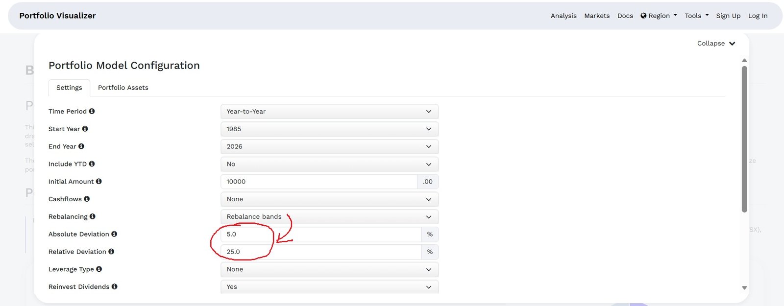
Threshold rebalancing triggers a rebalance only when an asset class drifts more than a set percentage from its target, say, 5%. This approach tends to reduce unnecessary trading while still controlling risk drift.
Source: https://www.portfoliovisualizer.com/
In my own testing, the difference in final portfolio value between annual rebalancing and no rebalancing over a 15-year period was often smaller than people expect. What rebalancing really controls is risk, not return. It keeps you from accidentally becoming an 85% equity investor when you thought you were 60/40.
Monte Carlo Simulation: What It Models and Where It Has Limits
Monte Carlo simulation is the feature I wish more investors understood. It sounds complicated, but the idea is simple.
Instead of showing you one historical path, Monte Carlo runs thousands of randomized scenarios based on your portfolio’s expected return and volatility. It then shows you the range of possible outcomes, the best case, the worst case, and everything in between, at a set confidence level.
Source: https://www.portfoliovisualizer.com
The output tells you something like: “Based on this portfolio’s historical return and volatility, there is a 90% chance the portfolio will be worth at least X after 30 years.”
That floor number is the one that matters most for retirement planning, because it represents the outcome you’re planning against, not hoping for.
The limitation worth knowing: Portfolio Visualizer’s Monte Carlo uses a normal distribution for returns, which tends to underestimate extreme tail events. Real markets crash harder and faster than the model assumes. Use the results as a planning range, not a precise forecast.
Stress Testing Your Portfolio Using the Drawdown Periods Table
Stress testing a portfolio means asking one question: how bad does it get, and how long does it hurt? Most investors think about risk in terms of average annual return. The drawdown
table reframes it around the experience of actually holding the portfolio through a real crisis.
In Portfolio Visualizer, the backtest results page includes a drawdown periods table below the main growth chart that does this automatically. It surfaces every significant decline in
your analyzable history and shows the peak date, trough date, recovery date, maximum drawdown percentage, and how long the portfolio stayed underwater before recovering.
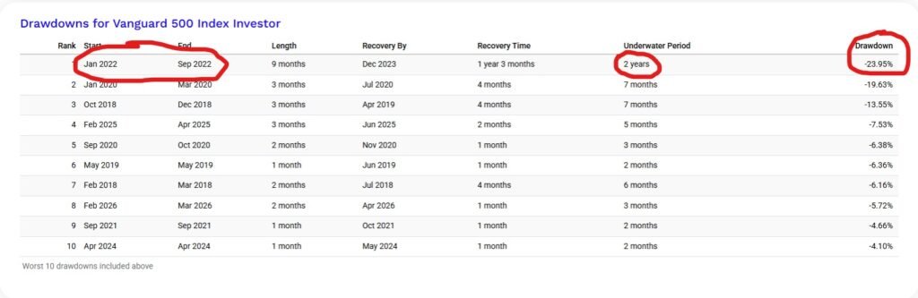
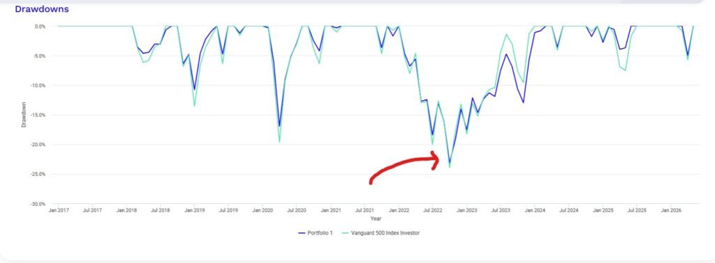
Drawdowns for the the VTI/VXUS/BND portfolio
For the VTI/VXUS/BND portfolio, the table tells three distinct stories. The January 2022 drawdown was the worst by every measure: a 23.12% decline over 9 months, a recovery
that didn’t complete until February 2024, and a total underwater period of 2 years and 2 months. That is not a crash you ride out over a rough quarter. That is two years of watching your portfolio sit below its previous high.
Source: https://www.portfoliovisualizer.com
The COVID crash in early 2020 looks scarier on a chart than it was in practice. A 16.95% drop in three months is genuinely alarming, but the portfolio recovered fully by July 2020, a total underwater period of just 7 months. The severity was real. The duration was not.
The 2018 Q4 selloff follows a similar pattern: a sharp 10.77% drawdown over three months that recovered within seven months total.
The longest recovery time event
What separates 2022 from every other event in the table is the recovery time. The drawdown itself lasted 9 months. Getting back to the previous high took another 1 year and 5
months after that. The reason is the nature of the shock. 2020 and 2018 were demand or liquidity events, sharp, violent, and reversible once conditions changed. 2022 was an
inflation-driven rate hiking cycle, which compressed valuations across both equities and bonds at the same time. When both sides of a balanced portfolio fall together, there
is no cushion and no quick fix.
There are also two recent entries worth noting. The December 2024 to March 2025 drawdown of 3.95% took 6 months to fully resolve, which is longer than the severity suggests. And
March 2026 produced a 4.98% single-month drawdown that recovered in April, a short, sharp event consistent with tariff-driven market volatility in early 2026.
Ten events over roughly 10 years, with only one that tested a long-term investor’s resolve. That is actually a useful data point in itself: for a diversified low-cost ETF portfolio, the number of serious multi-year drawdowns in the past decade was one. The question to answer before you invest is whether you could have held through 2 years and 2 months of being underwater without selling.
Monte Carlo Simulation: Forward-Looking Portfolio Survival
The Monte Carlo simulation tool answers a different question than backtesting. Backtesting shows you what happened. Monte Carlo asks whether your portfolio can survive what might
happen, specifically whether it can sustain planned withdrawals over a long retirement horizon.
The tool runs thousands of randomized scenarios based on your portfolio’s historical return and volatility, then shows you the probability that your portfolio survives to the end of your target period without running out of money. You set the withdrawal amount, the withdrawal frequency, monthly, quarterly, or annually, and the time horizon, and the simulation tells you what percentage of scenarios end with money still in the portfolio.
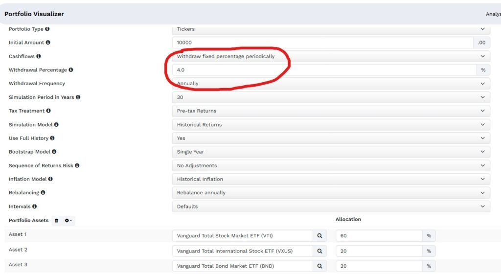
Source: https://www.portfoliovisualizer.com/
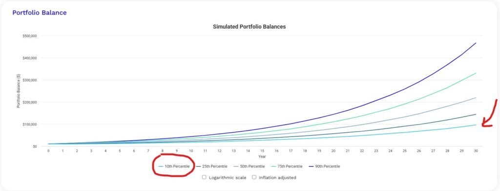
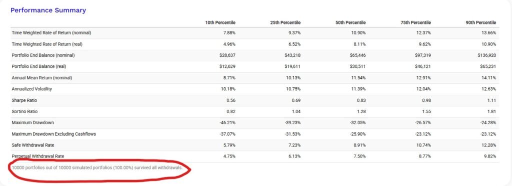
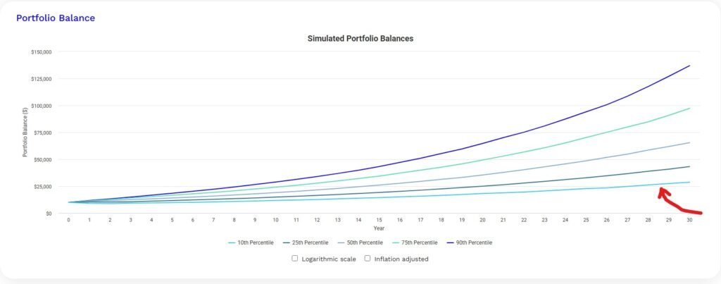
The output gives you two things worth paying attention to. The survival rate, the percentage of simulated scenarios where the portfolio doesn’t run out, is the headline number. A survival rate above 90% over a 30-year horizon is generally considered robust. The second is the 10th
percentile outcome value, which represents the floor of realistic expectations. Planning against that number rather than the median is what separates conservative retirement planning from optimistic retirement planning.
This is where the Monte Carlo tool earns its place alongside the drawdown table. The drawdown table shows you the worst periods your specific portfolio has already survived. Monte
Carlo shows you whether your withdrawal plan holds up across thousands of futures that haven’t happened yet, including sequences of bad returns early in retirement, which are far
more damaging than bad returns late.
One important limitation: Portfolio Visualizer’s Monte Carlo uses a normal distribution for returns, which tends to underestimate extreme tail events. Real market crashes happen
faster and harder than the model assumes. Treat the survival rate as a planning range rather than a precise probability.
Rolling Returns: The Most Underused Feature
Rolling returns analysis is something most investors have never tried, and it might be the most honest way to evaluate a portfolio.
Instead of showing you a single return number for the full backtest period, rolling returns calculate the annualized return for every possible holding period of a given length within your data range.
For example, rolling 10-year returns show you what an investor earned in every 10-year window from 1985 to 1995, 1986 to 1996, 1987 to 1997, and so on.
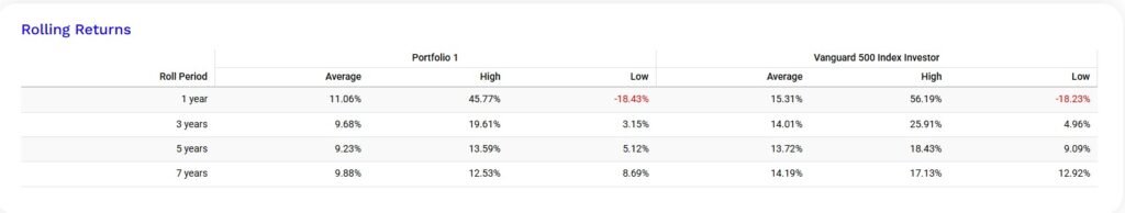
Source: https://www.portfoliovisualizer.com/
What this reveals is the range of realistic outcomes for someone who invested at the wrong time. The worst 10-year return window for a diversified equity portfolio in recent history was still positive, but barely. That context is more useful for long-term planning than a single number that assumes you invested at the perfect moment.
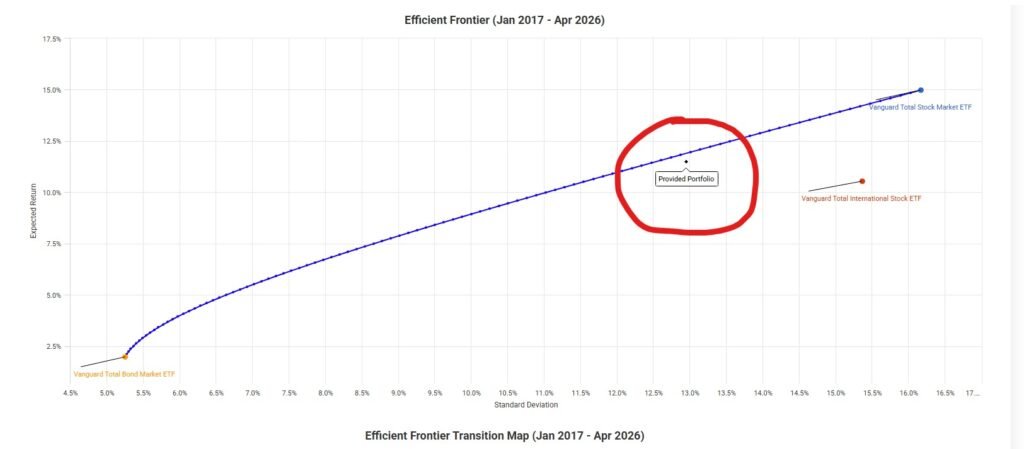
Asset Allocation Optimizer: What It Can and Cannot Do
The asset allocation optimizer is one of Portfolio Visualizer’s more advanced features. You give it a list of asset classes and a constraint (maximize Sharpe ratio, minimize volatility, or target a specific return), and it produces an “optimal” allocation based on historical data.
I want to be direct about something here. Optimized historical allocations often look brilliant
in backtests and perform mediocrely going forward because the optimization is curve-fitting to past data. The tool is useful for exploring how different asset classes have interacted historically,
not for finding a magic allocation to copy.
Source: https://www.portfoliovisualizer.com/
Use this feature to understand diversification mechanics and correlation between asset classes.
Don’t use it to construct a portfolio by running the optimizer and copying the output directly.
ETF and Mutual Fund Support: What You Can Actually Backtest
One of the most common questions I see is whether Portfolio Visualizer supports specific ETFs.
The short answer is yes for most major US ETFs, with some limitations on data history.
For US investors, the main tickers work reliably: VOO, VTI, VXUS, BND, VT, AGG, SPY, QQQ, and most iShares and Vanguard ETFs.
For funds launched after 2010, the available history is naturally shorter. Portfolio Visualizer fills gaps using the underlying index data where possible, which is noted in the results.
Mutual funds work too. VFINX, VFIAX, and other Vanguard mutual fund tickers are fully supported, which is useful for comparing the historical performance of equivalent ETF and mutual fund structures over the same period.
For Canadian investors using all-in-one ETFs like XEQT, VEQT, or VGRO, these tickers have limited history since they launched in 2018 and 2019. The practical workaround is to build a manual equivalent: XEQT is roughly 100% global equity, which you can model as 45% VTI, 40% VXUS, and 15% XIC (or use VT as a single-ticker global proxy). VGRO is approximately 80% equity and 20% bonds, which you can model as 64% VTI plus 16% VXUS plus 20% BND.
Free Tier vs Paid: What Is Actually Limited
Most investors never need the paid plan. Here is what the free tier gives you and where it stops.
Free tier includes: backtesting with monthly rebalancing, Monte Carlo simulation, stress testing with simulations and estimating drawdowns from historical scenarios, rolling returns analysis, asset allocation analysis for up to three portfolios, and factor analysis at the portfolio level. Data history goes back to 1972 for major asset classes and 1985 for most mutual funds.
Paid plan adds: additional factor models, individual security backtesting, more simultaneous portfolio comparisons, longer data history for some funds, and custom benchmarks. At around $20/month it is reasonable if you are doing serious research, but unnecessary for most individual investors building and monitoring a long-term passive portfolio.
The free tier limitation that trips people up most often is the maximum number of assets per portfolio, which is capped at around 10 tickers. For most three-fund or five-fund investors, this is not an issue.
How to Get the Most Out of Portfolio Visualizer
Do not use this tool to run one backtest. Seeing a great result and treating it as validation may be misleading. That is not what backtesting is for.
The right way to use Portfolio Visualizer is to test your portfolio against multiple scenarios,
compare it to simpler alternatives, and pay most attention to the downside metrics, maximum drawdown, worst year, and the 10th percentile Monte Carlo outcome. If you can live with those numbers, the portfolio is probably right for your risk tolerance.
Run your portfolio, then run a one-fund alternative like VT (total world market, MER 0.07%). If your complex multi-asset portfolio barely outperforms the single-fund option on a risk-adjusted basis, that is useful information. Complexity is not free, it costs you rebalancing effort and behavioral risk.
Conclusion
Portfolio Visualizer is one of those tools that rewards the investors who take time to understand it. The backtesting feature is solid, the Monte Carlo output is genuinely useful for planning, and the stress testing scenarios are the most honest way I know to reality-check your risk tolerance before a real crash tests it for you.
For a full step-by-step walkthrough of running a Canadian ETF portfolio backtest, including how to proxy Canadian-listed ETFs using US equivalents, the Portfolio Visualizer backtest tutorial for Canadian investors covers that process with screenshots.
Use the free calculator at datasavvyfinance.com to see how your portfolio’s expected return and fee level affect long-term growth before you backtest the specific allocation in Portfolio Visualizer.
Frequently Asked Questions
Portfolio Visualizer’s core features, including backtesting, Monte Carlo simulation, stress testing, rolling returns, and the asset allocation optimizer, are available on the free tier with no login required. A paid plan at approximately $20 to $30 per month unlocks additional factor models, more simultaneous portfolio comparisons, and longer data history for some funds. The free tier is sufficient for most individual investors building and monitoring a long-term passive portfolio. Verify current tier availability and pricing at portfoliovisualizer.com as these may change.
Portfolio Visualizer uses monthly return data going back to 1972 for major US asset classes and broad index funds. Individual ETFs are limited by their actual launch date, a fund that launched in 2018 will only have data from 2018 regardless of the tool. The free tier provides approximately 9 to 10 years of backtesting history on the current version. The legacy version at legacy.portfoliovisualizer.com does not provide access to longer historical datasets without subscription. Data availability varies by security, the tool notes any data
constraints in the results.
XEQT and VEQT launched in 2018 and 2019, so direct backtesting history is limited to approximately 5 to 6 years. A common approach is to model equivalent portfolios using longer-history US-listed ETFs with similar asset class exposure. For example, XEQT is approximately a 100% global equity fund that can be modelled using VT (Vanguard Total World) as a single-ticker proxy. VGRO is approximately 80% equity and 20% bonds, which can be modelled as 80% VT and 20% BND. ETF examples are for illustrative purposes only and are not investment recommendations. Comparable products from other providers may exist. Verify holdings and allocations on the fund provider’s website before using any proxy.
Backtesting runs your proposed allocation against actual historical market data, it shows you one specific historical path based on real returns during a specific time period. Monte Carlo simulation generates thousands of randomized scenarios based on your portfolio’s historical return and volatility, producing a probability distribution of possible future outcomes. Backtesting answers “how did this perform historically?” Monte Carlo answers “what is the range of possible outcomes going forward?” Both use historical data as input. Neither predicts the future. Portfolio Visualizer’s Monte Carlo uses a normal distribution for returns, which tends to underestimate the frequency of extreme market events.
Portfolio Visualizer’s database is primarily built around US-listed securities. Canadian-listed ETFs have limited data history in the tool since most launched in 2018 or later. Canadian investors typically model their portfolios using US-listed ETFs with equivalent asset class exposure as proxies, for example, using VTI for Canadian total equity exposure or BND for Canadian bond exposure. Before using any proxy, compare the top holdings and geographic allocations on the fund provider’s website to verify structural similarity. The tool does not model Canadian account types (TFSA, RRSP) or Canadian tax treatment, those factors would need to be considered separately. ETF examples are illustrative only and not investment recommendations.
Rolling returns analysis calculates the annualized return for every possible holding period of a given length within the historical data range. For example, 10-year rolling returns show the annualized return for every 10-year window, 1985 to 1995, 1986 to 1996, 1987 to 1997, and so on. This shows the range of realistic outcomes for investors who started at different points in the market cycle, rather than a single return number that assumes perfect entry timing. The worst 10-year rolling return window is one of the most useful data points for evaluating whether an allocation’s downside risk is acceptable over a realistic holding period.
The asset allocation optimizer generates historically optimal allocations based on a specified objective, maximizing Sharpe ratio, minimizing volatility, or targeting a specific return level. It uses historical return and correlation data to calculate which combination of assets produced the best risk-adjusted outcome over the analyzed period. The key limitation: historically optimized allocations are based on past data and often perform differently in future periods because they are fitted to historical patterns that may not repeat. The optimizer is most useful for understanding how different asset classes have interacted historically, not for directly constructing a portfolio by copying its output.
The free tier includes backtesting, Monte Carlo simulation, rolling returns, drawdown analysis, and the asset allocation optimizer, the core tools described in this guide. Data history on the current free tier is approximately 9 to 10 years. The free tier limits portfolios to approximately 10 tickers simultaneously, which is sufficient for most three-fund or five-fund investors. The paid plan unlocks additional factor models, longer data history, more simultaneous portfolio comparisons, and export capabilities. The legacy version at legacy.portfoliovisualizer.com does not provide longer history without account. Always verify current tier limits at portfoliovisualizer.com.
Disclaimer
This article is for educational and informational purposes only and does not constitute financial, investment, or tax advice. The content shared represents my personal investment journey and analysis, not recommendations for your specific financial situation.
Important considerations:
- Past performance does not guarantee future results. Investment returns and portfolio performance can vary significantly based on market conditions, timing, and individual circumstances.
- Every investor’s situation is unique. Your risk tolerance, time horizon, tax situation, and financial goals may require a completely different investment approach than what I’ve described.
- Tax rules are complex and change frequently. Foreign withholding tax rates, MER calculations, and RRSP regulations may differ from what’s presented here or may have changed since publication.
- Do your own research. Verify all cost calculations, tax implications, and ETF details independently before making investment decisions.
- Consider professional advice. For personalized investment guidance, consult with a qualified financial advisor, tax professional, or investment counselor who understands your complete financial picture.
This website does not replace advice from licensed financial advisor, tax professional, or investment counselor. This content reflects our personal research and decision-making process, shared for educational purposes to help other DIY investors understand the analytical approach behind portfolio optimization.
Please invest responsibly and never invest more than you can afford to lose.