What Daily Traders Can Learn from Long-Term Portfolio Tools like Portfolio Visualizer
Introduction
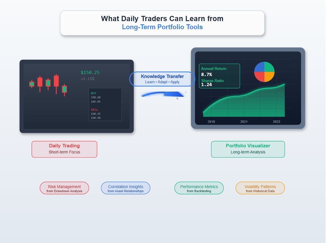
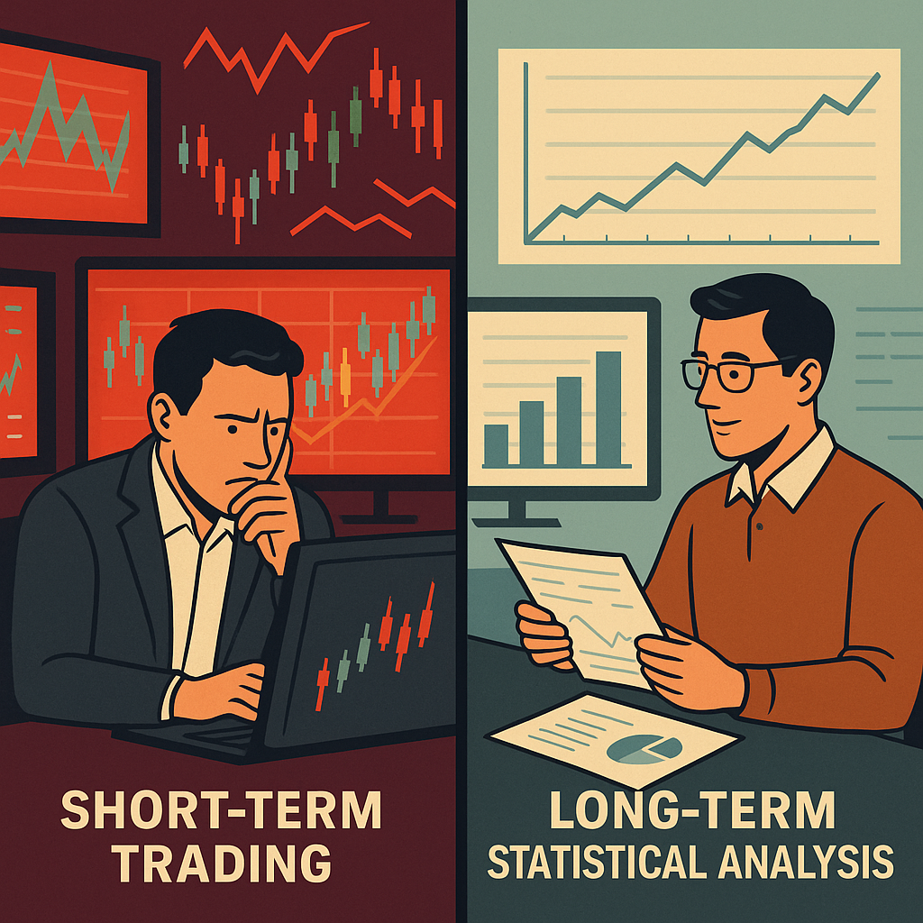
In the world of investing, two seemingly opposing approaches exist: active daily trading vs long-term investing. Day traders ride the waves of intraday volatility, while long-term investors take a more measured, data-driven approach. But what if there was a way to bridge the gap? In this article, I share why long-term portfolio analysis tools like Portfolio Visualizer offer insights that can also benefit short-term traders, and how you can use data-backed intuition to sharpen your trading edge.
Before diving into the link between daily trading vs long-term investing, please make sure you cover the basics:
- Building ETF asset allocation guide
- The impact of Management Expense Ratio on the portfolio growth
- The complete guide to building efficient etf portfolios with Portfolio Visualizer
- Deep dive on Quantitative Investment Strategies
The Structural Difference Between Daily Trading and Investing
- Day trading demands speed and timing. Decisions are made in minutes or seconds.
- Long-term investing emphasizes strategy, allocation, and consistency.
As a statistician, I’ve always been drawn to the structured nature of long-term investing. It gives me the time to test models, evaluate portfolio behavior under various conditions, and ultimately build strategies that optimize for return and minimize risk.
Why Portfolio Visualizer Is a Favorite Tool Portfolio Visualizer offers tools that are indispensable to long-term investors:
- Asset allocation optimization (e.g., mean-variance optimization)
- Backtesting with historical returns and volatility
- Monte Carlo simulations
- Risk-adjusted metrics (Sharpe, Sortino, Ulcer Index)
- Correlation matrices and drawdown timelines
These tools are grounded in solid statistical reasoning. They’re not about guessing market direction, they’re about understanding risk and reward.
How This Helps Short-Term Traders Too Even if you’re an active trader, you benefit from understanding an asset’s long-term behavior. Here’s how:
- Volatility Profiles: Knowing how volatile an ETF is historically can inform your stop-loss settings.
- Correlation Insights: Recognizing how assets move together can prevent overexposure.
- Drawdown Awareness: Awareness of worst-case scenarios sharpens your risk management.
By incorporating these insights, even short-term traders make better decisions not because they’re predicting the market, but because they’re not flying blind.
Bridging the Gap Between Intuition and Data Most technical indicators are based on heuristics. Portfolio Visualizer, by contrast, roots its analysis in tested statistical frameworks. As a result, it helps investors of all types develop better intuition:
- You understand how assets behave over time.
- You recognize recurring patterns across macro cycles.
- You learn to respond rationally during volatile markets.
That’s valuable whether you’re rebalancing a TFSA or trying to time a trade during earnings season.
What Do We Mean by “Most Technical Indicators Are Based on Heuristics”?
Heuristics are rules of thumb, simple, experience-based guidelines or shortcuts that traders use to make decisions.
They’re not grounded in statistical theory, and they don’t test assumptions or account for uncertainty.
Examples:
- “Buy when the RSI is below 30”
- “Sell when the 50-day moving average crosses the 200-day moving average”
- “Support and resistance lines predict future price bounces”
These patterns may work sometimes, but they’re often based on visual patterns or historical habits, not statistical validation.
How Is That Different from Statistical Models?
Statistical models attempt to:
- Explain or predict relationships between variables using data
- Quantify uncertainty and confidence
- Test hypotheses and check assumptions
- Produce results that can be replicated, evaluated, and validated
Example using Portfolio Visualizer:
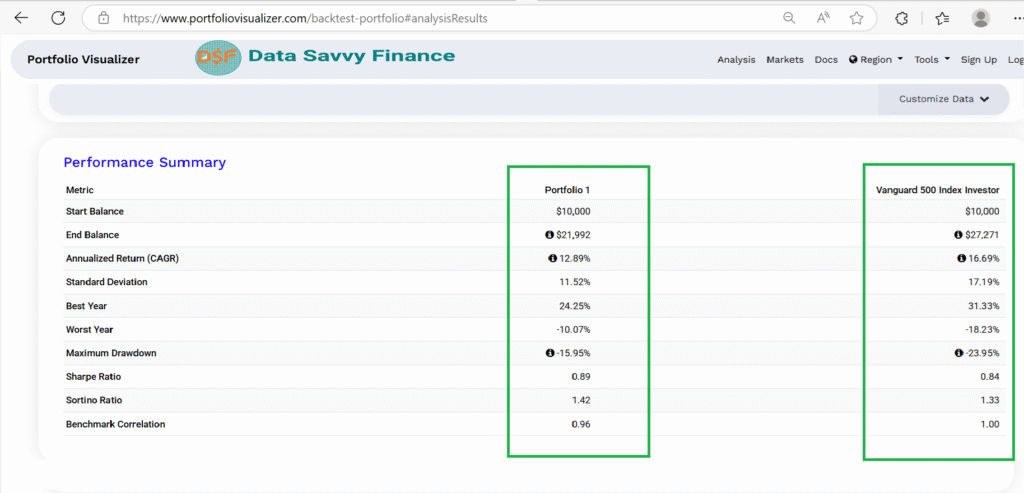
- Backtesting a portfolio over 20 years to see how different asset combinations performed under real market conditions
- Computing Sharpe ratio, standard deviation, and maximum drawdown to quantify risk-adjusted performance
This isn’t just looking at patterns, but it’s asking deep questions such as:
What are the trade-offs between risk and return?
How likely is this performance due to chance?
How consistent is it across different market environments?
A Simple Analogy

A Simple Analogy
Heuristics
Statistical Models
"Red means stop"
Traffic analysis modeling accident rates
"It worked last time, so I'll try again"
"Let's test if this strategy works 95% of the time"
Gut feeling based on charts
Probability distributions and simulations
Heuristics are like educated guesses based on patterns and habits.
Statistical models are like carefully tested theories built on data and probability.
One may feel faster, but the other is more reliable over time.
Why Time Horizon Changes Everything
Most common technical indicators, like RSI, MACD, or moving averages — are based on univariate heuristics. That means they look at a single variable (like price or volume) over time, without considering other influential factors.
For example:
The RSI tells you whether an asset is “overbought” or “oversold” based only on recent price movement.
But it ignores everything else, earnings reports, interest rates, inflation, geopolitical events, or broader market sentiment.
Real Markets Are Multivariate and News-Driven
Markets don’t move in isolation. Every trading day is influenced by:
- Overnight news (economic reports, global events, central bank updates)
- Shifts in investor sentiment
- Sector rotations
- Correlations between markets (e.g., oil prices and Canadian equities)
For instance: a strong jobs report from the U.S. released after markets close might cause a surge in stock prices at the next Canadian market open, regardless of what any technical chart said yesterday.
So while technical indicators can sometimes capture patterns, they’re blind to context. That’s why they often fail during regime shifts or black swan events.
What Traders Can Borrow from Portfolio Construction
Statistical tools like those in Portfolio Visualizer allow you to:
- Model multiple variables simultaneously
- Evaluate asset behavior across different macro environments
- Simulate outcomes under a variety of real-world scenarios
- Understand not just what happened, but why and how often
Heuristics may be quick and easy, but they’re fragile.
Long-term statistical analysis embraces complexity and uncertainty, making it more resilient, informed, and ultimately more useful for building portfolios that can weather different market conditions.

Conclusion
Portfolio Visualizer is more than a backtesting tool. It’s a compass for anyone who values informed decision-making. Whether you’re investing for retirement or trading the morning open, a statistical understanding of your portfolio’s components will make you better. As someone who enjoys taking the time to get the models right, I can say this: long-term tools don’t just build better portfolios, they build better investors.